Top Perfume Box Designs for Gift Giving and Home Decor
Top perfume box designs for gift giving and home decor, with real use cases and a structure match table. Covers magnetic closure boxes, lid and base boxes, paper drawer boxes, and paper tube packaging, plus finishes like foil and emboss for OEM/ODM bulk orders.
If you sell fragrance, you already know the awkward truth: people judge the scent before they smell it. They judge the box first. And when the box looks good and feels good, customers keep it on a vanity or shelf like a decor piece. That’s how a perfume box stops being “packaging” and starts doing brand work for you.
I’m going to break down the most practical perfume box design ideas for gift giving and home decor, plus where each one fits in real-world buying scenes (procurement teams, startups, distributors, OEM/ODM runs, bulk wholesale orders). I’ll also point you to a few box styles from our perfume boxes line so you can match the idea to an actual structure.
Presentation Matters: the first-second “wow” for gift giving
A gift box has one job: make the receiver pause for a second and think, “oh… this is nice.” That pause is value.
What creates that pause fast:
Clean edges (tight wrap, no bubbles)
A confident color (not muddy)
Texture you can feel (soft-touch, linen paper, emboss)
A closure that sounds premium (magnet snap, crisp lift-off lid)
Real scene: You’re doing PR drops to influencers. They film unboxing in one take. If the box fights back (sticky tape, weak lid, messy insert), your product looks cheap on camera even if the juice is great.
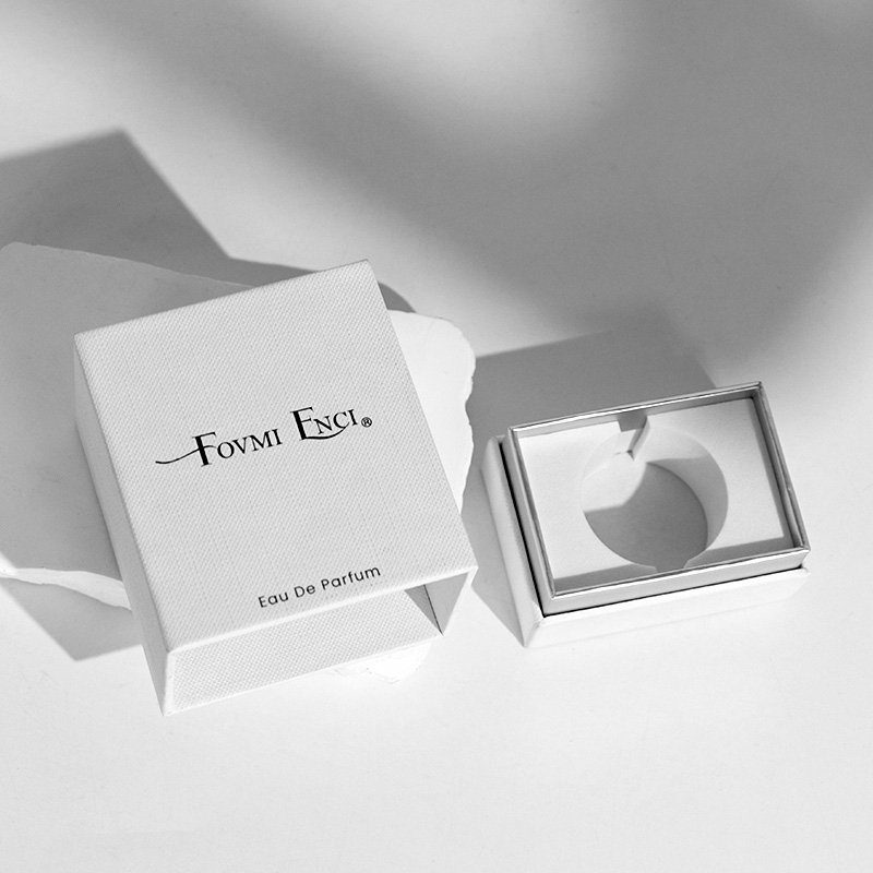
If you need a structure that naturally upgrades the unboxing vibe, start with a rigid style like Magnetic Closure Boxes or a classic rigid Lid and Base Boxes. Both read “gift” instantly.
Functionality and Reuse: make it useful so people don’t toss it
A beautiful box that becomes clutter is a lose. People won’t keep it, and your brand disappears from their room.
Design for reuse on purpose:
Add inner tray that becomes a small organizer
Make the lid strong enough to open/close for months
Keep the footprint friendly (not too tall, not too wide)
Use inserts that look clean even after the bottle is removed (EVA, paper pulp, paperboard)
Home decor reality: A lot of customers keep boxes as “pretty storage.” Rings, hair clips, travel minis, desk bits. If your box can play that role, you earn extra exposure in their daily life. That’s long-tail branding, and it’s quiet but real.
A very practical reuse-friendly format is Paper Drawer Boxes. Drawer boxes don’t feel like trash. They feel like storage.
Key Elements: structure, materials, color, and tactile details
When buyers say “make it luxury,” they usually mean: the box feels expensive in the hand.
Here’s what actually drives that feel:
Structure: rigid walls, tight corners, stable lid fit
Material: good paper wrap, decent board thickness, clean lining
Insert: bottle sits straight, no shake, no rattle (drop-test mindset)
Print control: Pantone match when branding matters, not “close enough”
Procurement pain point: color drift across batches. If you’ve ever opened cartons and saw “same design, different black,” you know the headache. Lock down specs early: paper, film, ink, finishing, and a real sample approval flow.
Popular Materials: what they signal in the customer’s brain
Material choice isn’t just “eco” or “not eco.” It’s a message.
Rigid paperboard + premium wrap: classic luxury signal, best for gifting
Paper tube packaging: modern, clean, sometimes “apothecary” feeling
Corrugated (colored) with good print: bold, youthful, shipping-friendly
If you want something that sits nicely on a bookshelf or vanity and still looks designed, Paper Tube Packaging does that really well. Tubes also photograph nice because the silhouette is strong.
And yes, if you’re selling to brands that care about sustainability claims, being FSC certified helps the conversation go smoother. Buyers don’t want risk.
Trends: minimal, sustainable, and story-led (but don’t overdo it)
Trends come and go, but a few are sticking because they match how people shop now:
Minimal layouts with one strong logo moment
Sustainable choices (paper-based structures, less plastic, cleaner inserts)
Story cues (small message card, subtle pattern, inside print)
Bold color blocks for shelf impact, especially for younger lines
Distributor scene: You’re carrying multiple brands and need fast sell-through. Minimal + clear brand blocks helps retail staff explain it quickly. It’s not always about being fancy. It’s about being easy to understand.
Color Schemes and Graphics: match the “smell” with the look
People expect the box to “translate” the scent. Not perfectly, just enough so it feels right.
Simple pairings that work in real buying behavior:
Floral / airy → soft pastels, light neutrals, clean line art
Woody / spicy → deep jewel tones, darker base colors, metallic accents
Avoid the common mistake: too many graphics. If everything shouts, nothing sells. Keep one hero element (logo, pattern, foil line) and let negative space do some work.
Decorative Items: how a perfume box becomes home decor
If your customer keeps the box in their space, you win extra impressions without spending extra ad money. But it has to look “decor-ready.”
Design moves that help:
Make the lid align perfectly (no wobble)
Use finishes that don’t fingerprint like crazy (soft-touch can, but matte helps)
Add inside printing for a “nice surprise” when opened
Choose shapes that stack or group well (sets look good on shelves)
Real scene: holiday gift sets. People buy 2–3 scents and display them together. If your packaging system looks cohesive as a group, it becomes part of the room styling.
Storytelling and Unboxing: keep it simple, keep it human
You don’t need a novel on the box. You need one clean story beat.
What works:
A short line inside the lid (brand voice)
A small card (how to layer, when to wear)
A subtle pattern tied to the scent notes (not too literal)
Startup scene: You’re launching your first line. You don’t have huge budget for retail displays. The box is the display. A story-led unboxing can make your brand feel bigger than it is, without being fake.
Luxury Details: foil, emboss, and that “I can feel it” finish
Luxury often comes from tiny details done consistently:
Foil stamping (gold, silver, rose, holographic if it fits brand)
Emboss/deboss logo (touch memory is real)
Soft-touch film or matte lamination
Clean shoulder lines on rigid structures
If you’re doing premium tiers, consider rigid formats (magnetic, lift-off lid). For more “structured luxury,” rigid perfume boxes also protect bottles better in shipping and bulk handling. Less damage, less drama.
Box Structure Match Table: gift giving + home decor, side by side
Design goal (what you want)
Best box structure
Why it works for gifting
Why it works for home decor / reuse
Premium unboxing with clean closure
Magnetic closure rigid box
Easy open, feels expensive, strong “snap”
Great keepsake box for jewelry, minis, desk items
Classic luxury look
Lid and base rigid box
Timeless, high-end shelf vibe
Stacks well, looks like decor storage
“Keepsake” feel with easy reuse
Paper drawer box
Feels like a gift drawer, neat reveal
Becomes organizer on vanity or office
Modern silhouette + display-friendly
Paper tube
Unique shape, easy to hold, looks curated
Works as decor even empty (plants, storage, display)
Safe bulk packing and brand color pop
Colored corrugated
Strong for shipping + bold retail color
Can store backups, looks less “trash” if designed right
If you want to browse the full structure family first, start here: perfume boxes. It’s easier to pick once you know your product size, bottle shape, and how it ships.
OEM/ODM and Bulk Wholesale: what buyers usually ask for (and what to prep)
If you’re ordering custom luxury perfume boxes in bulk, these questions show up every time:
What’s the MOQ for this structure and finish combo?
Can we lock Pantone and keep it stable across runs?
How do you do sample approval (dieline → white sample → color sample → final)?
Can you add insert options for different bottle shapes?
Will cartons survive long-distance shipping and warehouse stacking?
We build for OEM/ODM and scale runs, so it’s normal to start with one hero SKU and extend the same packaging language across the line. Consistency sells. It makes the brand look organized, even when you’re still growing.
Wrap-up: the simplest rule
If your perfume box looks gift-ready and lives nicely on a shelf, you’ve done the job. The box doesn’t just protect the product. It supports branding, retail conversion, and repeat visibility at home. That’s a lot of value for one piece of paperboard, tbh.
Since 1985, we’ve been a factory-direct partner for OEM/ODM custom luxury perfume boxes in China. One team handles design, sampling, production, and export logistics. Strict QC delivers on-brand packaging, fair pricing, and reliable lead times.
Flexible & Professional OEM/ODM Solutions
Agile OEM/ODM support with low MOQs and fast turnaround. Our engineers refine dielines, optimize structures and build custom inserts to protect each bottle. From concept to pre-prod samples, we accelerate launches with predictable cost and risk.