Perfume Boxes: The Packaging That Defines Your Scent
Perfume boxes shape first impressions before anyone smells the scent. This guide covers shelf impact, inserts, luxury finishes, Pantone control, FSC materials, gifting packs, magnetic closure boxes, drawer boxes, and labeling notes—built for OEM/ODM bulk buyers and brands.
You can have the best juice in the world, but if the box feels cheap, people will expect the scent to be cheap too. That’s just how brains work. In fragrance, коробки для духов don’t sit in the background. They set the mood, protect the glass, and quietly push the buyer toward “add to cart.”
If you’re sourcing for a big fragrance house, building a startup line, or doing private label, you already know the pain points: color drift, transit damage, messy inserts, slow sampling, and “why does this look different from last batch?” stuff. Let’s talk about how to avoid that—without making it sound like a textbook.
All Perfume Boxes – Custom Boxes Manufacturer
Хороший парфюмерная коробка does three jobs at the same time: protect, present, promote. In B2B projects, you also need the unsexy parts: dielines that actually fit, repeatable assembly, QC you can trust, and materials you can stand behind (like FSC-certified board).
If you want to see the full structure mix in one place, start here: коробки для духов. It’s basically a menu of box styles you can spec for different channels—retail, gifting, PR, subscription, travel minis, you name it.
Packaging Tells the Story Before the Scent
Packaging tells the story before the scent
Picture a shopper at a counter. They don’t smell first. They см. first. They touch the box, they clock the finish, they open it, and only then they try the fragrance.
That’s why packaging is doing brand work before the tester strip even comes out. If the box says “clean and modern,” your scent gets read as cleaner. If the box screams “heavy luxury,” people expect deeper notes. It’s not magic. It’s framing.
Practical tip: if you’re launching a new line, lock a simple “visual system” early—main color, one hero finish (foil or emboss), and a consistent logo placement. Keep it steady across SKUs so the shelf looks like one family, not random cousins.
Shelf Impact in Retail and E-Commerce
Retail shelf impact and feed-first shopping
On-shelf, your perfume box is a mini billboard. Online, it’s your thumbnail. Either way, you’ve got about one second to earn attention.
What actually works:
Clear hierarchy: brand name first, scent name second, details last
Contrast that reads from distance: matte + foil, light + dark, clean type
Repeatable cues: same spine layout, same icon placement, same “look”
If you sell to distributors, this matters even more. Their buyers don’t want “pretty.” They want fast recognition and fewer returns from crushed corners.
Protection, Inserts, and Transit Damage Control
Protection and transit damage control
Perfume is glass + alcohol. Translation: it breaks, leaks, and gets rejected fast. A box that looks good but ships bad is basically a return machine.
What smart teams spec:
Прочность жестких плит for crush resistance
Insert tolerance that actually matches the bottle (EVA, paperboard, pulp tray)
No shake when you do the “two-second rattle test”
Corner protection for e-commerce shipping
Also, don’t ignore the boring words: AQL, traceability, QC reports. They sound dry, but they save your launch. A tiny fit issue across 50k units becomes a nightmare real quick.
Luxury doesn’t mean “add everything.” It means the details feel intentional.
Common finishes that buyers notice instantly:
hot foil stamping (gold, silver, holographic)
emboss / deboss for logo texture
точечный ультрафиолет для контролируемого блеска
soft-touch lamination for that “can’t stop touching it” feel
The trick: pick один или два hero effects, then keep the rest quiet. Too many effects makes it look busy. And busy doesn’t feel premium, it feel like trying too hard.
Brand Consistency: Pantone Control and Prepress Proofs
Brand recognition with Pantone control
This is where a lot of packaging projects go sideways: your “brand red” becomes five different reds across batches.
If you’re buying in bulk, ask for:
Цели Pantone (not “close enough” CMYK guessing)
допечатные проверки before mass print
production samples that match the final paper + finish, not a random mock
When your distributor puts your line next to competitors, color consistency becomes part of trust. People don’t say it out loud, but they feel it.
Sustainable Materials: FSC Certified Board and Paper-Based Inserts
Sustainable materials without the cringe
Customers call out fake “eco” claims now. So instead of big green slogans, do real spec choices:
Сертифицированная FSC доска for responsible sourcing
reduce empty space (less “air shipping”)
switch foam to paper-based inserts when possible
use recyclable paper wraps and simpler coatings
Bonus: sustainability also helps procurement conversations. A lot of teams now have supplier checklists, and FSC tends to be a baseline requirement.
Gifting and Limited Editions: Unboxing as a Sales Moment
Seasonal gifting and limited editions
Holiday sets, Valentine drops, influencer PR kits—these aren’t just “nice extras.” They’re sales engines because the unboxing becomes content.
Here’s how teams turn packaging into a gift moment:
sleeves for seasonal artwork (fast change, low disruption)
rigid structures that open like a “reveal”
space for extras: mini, card, QR story tag, discovery vial
If your goal is premium gifting, a book-style clamshell does this really well. You can explore that structure here (one link only, promise): Подарочные коробки с раковиной.
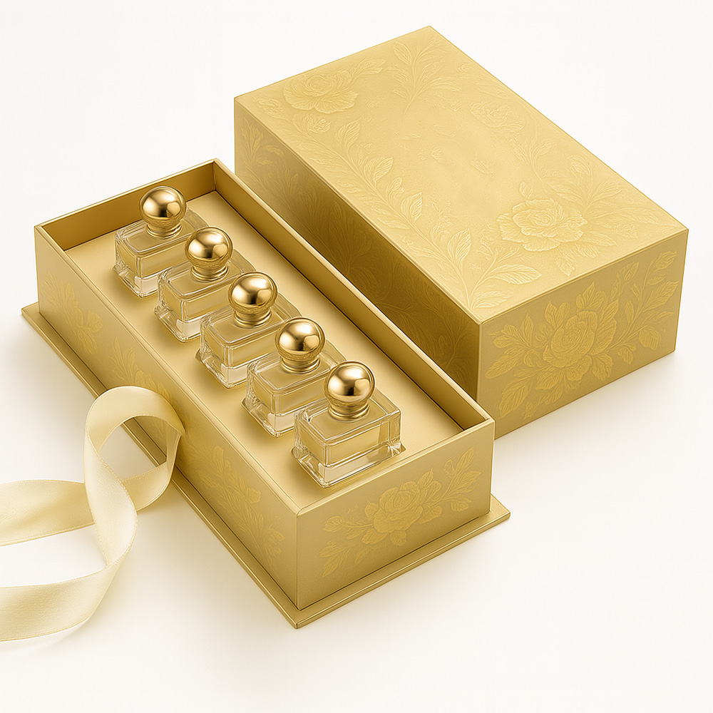
Functional Design: Magnetic Closure Boxes and Paper Drawer Boxes
User-centric opening experience
People remember the mechanic of opening. That little “click,” the smooth drawer pull, the clean hinge—those moments make the box feel expensive.
Two practical structures for that:
Жесткие коробки с магнитной застежкой: satisfying snap, great for PR kits and flagship SKUs Link once: Коробки с магнитными крышками
Drawer style boxes: controlled reveal, easy to add ribbons, sleeves, or a message card Link once: Ящики для бумаг
Small note (kinda obvious but people forget): if it’s hard to open, customers won’t think “premium.” They’ll think “annoying.” So test the pull force. Make it feel right.
Cosmetics Labeling Requirements and EU Fragrance Allergens Labelling
Cosmetics labeling requirements build trust
No, labels aren’t exciting. But they protect your channel relationships. Clean labeling helps buyers feel safe—especially in retail, where staff get questions like “where is it made?” or “what’s inside?”
Typical packaging teams keep basics consistent: net contents, responsible party info, and any required statements for the target market. Don’t wing it. It make your compliance team mad.
EU fragrance allergens labelling matters in real projects
If you sell into EU channels, you’ll hear about fragrance allergens labeling. Even when the ingredient line uses “parfum/aroma,” some allergens may need to be listed based on rules and thresholds. Talk with your compliance lead early so your artwork doesn’t get stuck at the worst time (right before launch).
Quick Table: 10 Arguments and Where They Come From
Argument title (use in your article)
What to check in real packaging work
Source type (no outbound links)
Packaging tells the story before the scent
color/finish/structure match brand mood
Packaging design best practice
Retail shelf impact and feed-first shopping
hierarchy, contrast, thumbnail readability
Packaging design best practice
Protection and transit damage control
rigid strength, insert fit, rattle test, QC
Практика проектирования упаковки
Luxury finishing details, not “more stuff”
foil/emboss/spot UV/soft touch selection
Практика упаковки предметов роскоши
Brand recognition with Pantone control
Pantone targets, prepress proofs, batch match
Print production practice
Sustainable materials without the cringe
FSC board, paper inserts, less empty space
FSC packaging guidance + buyer requirements
Seasonal gifting and limited editions
sleeves, reveal opening, space for extras
Retail & gifting practice
User-centric opening experience
magnetic snap, drawer pull force, hinges
Structure engineering + user testing
Cosmetics labeling requirements build trust
label basics aligned to market rules
FDA cosmetics labeling overview (US)
EU fragrance allergens labelling matters
artwork planning for EU allergen rules
European Commission guidance (EU)
Perfume Box Structure Match Table
Sales channel / usage scene
Ключевое слово структуры
Why teams pick it
One-page reference
Flagship EDP / premium gifting
magnetic closure rigid box
strong reveal, reusable feel, great for foil/emboss
If you’re buying коробки для духов in bulk, don’t treat packaging like decoration. Treat it like a system: structure + insert + print control + QC. That’s how you protect the bottle, keep branding tight, and make the scent feel like it’s worth the pick.
And yeah—when people say “the packaging defines your scent,” they’re not being poetic. They’re being practical.
С 1985 года мы являемся прямым партнером OEM/ODM по производству элитных парфюмерных коробок в Китае. Одна команда занимается дизайном, отбором образцов, производством и экспортной логистикой. Строгий контроль качества обеспечивает фирменную упаковку, справедливую цену и надежное время выполнения заказа.
Гибкие и профессиональные решения OEM/ODM
Гибкая поддержка OEM/ODM с низким MOQ и быстрым выполнением заказа. Наши инженеры дорабатывают линии, оптимизируют конструкции и создают индивидуальные вставки для защиты каждой бутылки. От концепции до готовых образцов мы ускоряем запуск производства с предсказуемыми затратами и рисками.
Широкий ассортимент высококачественной продукции
Всевозможные варианты роскоши: жесткие магнитные коробки, коробки с ящиками, коробки с вырезом для плеча и индивидуальные лотки из EVA/пенопласта/целлюлозы. Отделка премиум-класса - фольга, тиснение/дебосс, точечное УФ-излучение - плюс бумага из FSC/переработанного сырья повышают эффектность, надежность упаковки, экологичность и защиту бутылок.