Perfume Box Design: A Brand’s Guide from Concept to Unboxing
A practical perfume box design guide: define brand positioning, start from bottle specs, choose finishes and materials, then pick structures like magnetic, drawer, lid-base, or folding carton for bulk OEM/ODM launches.
Before anyone smells your fragrance, they touch it. They see the box, feel the paper, hear the lid, and decide (super fast) if your brand feels “worth it.” That’s why perfume box design isn’t just decoration. It’s positioning, protection, and persuasion—rolled into one perfume box.
If you’re buying packaging for a big brand launch, you probably care about repeatability: same color, same fit, same finish across runs. If you’re a startup, you care about speed, guidance, and not getting stuck with a structure that looks nice but ships terribly. Either way, the process is the same: lock the concept, engineer around the bottle, pick the right structure, then choreograph the unboxing.
I’ll keep it practical, with real buying scenarios and the box types you can actually source in bulk.
Perfume box design starts with brand positioning
Packaging is the first physical promise
Think of the box like a handshake. Weak handshake? People judge. Same thing here. Your perfume box is the first physical promise your brand makes, so it has to match your price tier and vibe.
Quick scenario:
You’re launching a “quiet luxury” scent. If the box uses loud graphics and thin board, you’ll fight your own positioning.
On the other hand, if you use clean typography, tight edges, and a soft-touch finish, the box does the talking before the copywriter even shows up.
Communicate positioning fast
A shopper gives you seconds. Procurement teams do too. So your box must signal “what this is” at a glance:
Modern / niche: minimal layout, strong negative space, sharp contrast
Bold / playful: color blocking, punchy motif, maybe a window (when it fits the story)
If you want a fast overview of structures used across launches, skim the main perfume boxes range and map each style to your channel (retail, e-com, gifting, PR kits).
Bottle-first packaging engineering
The bottle defines the box
Don’t start with “pretty.” Start with the bottle spec:
bottle width/height, cap shape, pump clearance
weight (glass is unforgiving)
if you bundle extras (mini, tester strip, booklet), include them now—not later
This is where a lot of teams mess up. They finalize artwork, then realize the bottle rattles. Now you’re changing the structure late, which hits timeline and consistency.
Inserts and tolerance control
In the packaging world, “fit” is king. People call it tolerance: how tight the lid is, how snug the insert holds the bottle, how clean the reveals look.
Common insert routes (pick based on brand tone + transit risk):
EVA/foam: strong bottle control, very “premium kit” feeling
paperboard insert: cleaner sustainability story, lighter, often cheaper to ship
molded pulp: eco-forward, tactile, modern—when your audience cares
Pro tip: if your procurement team wants fewer headaches, standardize insert geometry across 30/50/100ml where possible. It makes multi-SKU production way less chaotic.
Materials and finishes for luxury perfume boxes
Finishes add perceived value
Finishes aren’t “extra.” They’re a lever. Use them like a brand tool:
Hot foil = classic luxury signal
Emboss/deboss = quiet craft, touch-first branding
Spot UV = modern contrast and “light play”
Soft-touch lamination = instantly more premium in-hand
Just don’t stack everything at once. A box with foil + emboss + spot UV + heavy patterns can look busy fast. One hero finish, one support finish, clean execution—that’s usually the move.
Sustainable materials and FSC boards
Sustainability isn’t only about saying “recyclable.” Buyers want a story that feels real:
fewer mixed materials
paper-forward builds
FSC boards when it matches brand requirements
right-sized packaging (less air, less filler, fewer damages)
If your product will ship heavily through e-commerce, you’ll feel this pain point immediately: damaged corners = returns, bad reviews, and a brand hit.
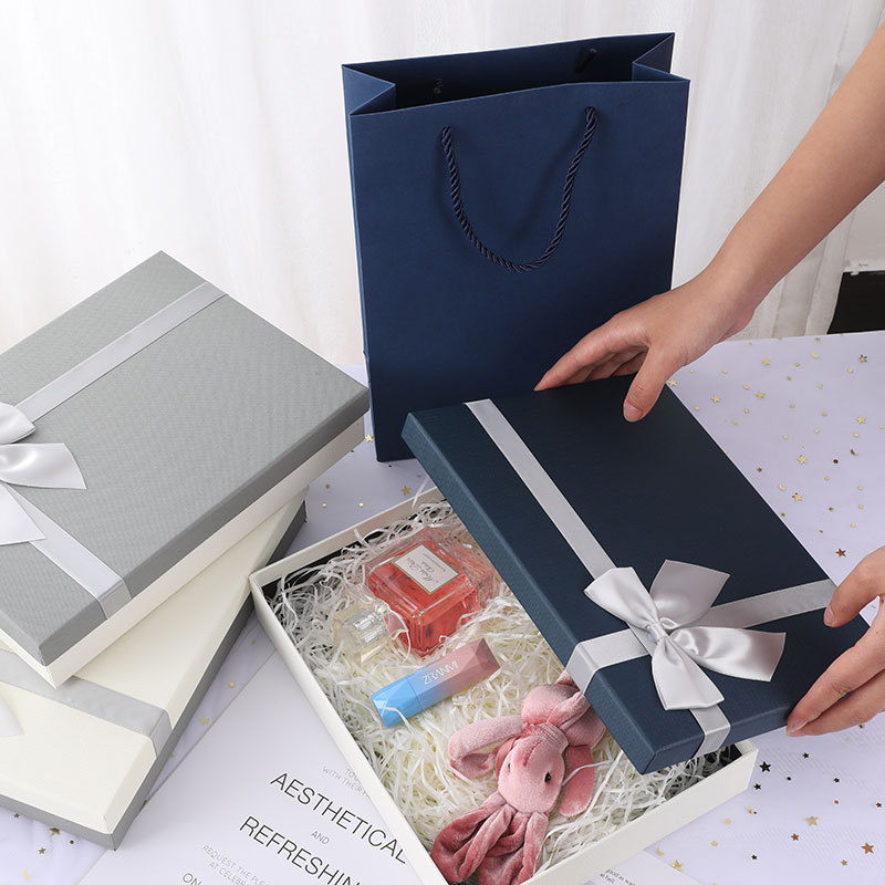
Unboxing experience and box structures
Now the fun part: structure. This is where you design the moment.
Magnetic closure boxes for a crisp snap
Magnetic boxes sell the “ritual.” That click is a tiny dopamine hit, and customers remember it. They’re great for hero SKUs, flagships, and PR kits where you want a premium reveal.
the opening should feel controlled (not sticky, not loose)
the inner tray should stop the bottle from “walking” during transit
the lid alignment must stay tight across bulk runs (this is where factory QA matters)
Real-world use case: influencer mailers. If the unboxing looks clean on camera, your packaging becomes marketing content for free.
Paper drawer boxes for discovery sets
Drawer boxes are made for “pull and discover.” They work crazy well for sampler sets, minis, layering kits, and anything you want people to keep on a dresser.
ribbon pull or metal pull (depends on your aesthetic)
“pull force” should feel smooth, not cheap
compartments help stop scuffing between mini bottles
Use-case that buyers love: subscription drops. Drawer-style packaging makes each month feel like a reveal, even if the product assortment changes.
Lid and base boxes for timeless retail
Lid-and-base is the classic for a reason. It stacks well, looks premium, and plays nice with co-packing lines.
If you want that core-line look, Lid and Base Boxes are a clean choice for department store shelves and travel retail:
simple opening, strong structure
easy to standardize across SKUs
great canvas for foil or emboss branding
This structure often wins when procurement wants “low drama packaging” that still feels upscale.
Folding carton for travel sizes and fast campaigns
For minis, travel sizes, and fast-moving promotions, folding carton makes sense. It’s lightweight, store-friendly, and good for multi-SKU campaigns with frequent artwork swaps.
Since 1985, we’ve been a factory-direct partner for OEM/ODM custom luxury perfume boxes in China. One team handles design, sampling, production, and export logistics. Strict QC delivers on-brand packaging, fair pricing, and reliable lead times.
Flexible & Professional OEM/ODM Solutions
Agile OEM/ODM support with low MOQs and fast turnaround. Our engineers refine dielines, optimize structures and build custom inserts to protect each bottle. From concept to pre-prod samples, we accelerate launches with predictable cost and risk.