心配しないで、すぐに上司に連絡してください
慌てずに、私たちのボスに直接ご相談ください。通常1時間以内に返信します。
香水箱メーカー
中国のOEM/ODMの注文の贅沢な香水箱の製造業者
SSL/3.0を使用してお客様のプライバシーを暗号化します。

See what’s shaping luxury perfume packaging right now: minimalist looks, FSC-friendly materials, matte/gloss contrast, embossing, foil accents, clear windows, art graphics, and personal touches. Includes real-use scenes and box-style picks for OEM/ODM, wholesale, and brand launches. Steady QC. Today.
If you buy fragrance packaging for a living, you already know this truth: the perfume box does more than “hold a bottle.” It sets the price mood. It signals quality. It makes people feel something before they even smell anything. Unbox’s 2025 trend breakdown lines up with what brands ask factories for every day—clean visuals, better materials, and an unboxing flow that feels intentional.
Below, I’ll map those trends into real packaging scenes, plus which 香水箱 styles usually fit best when you’re doing OEM/ODM and bulk runs.

| Trend / argument you can cite | What buyers actually want | Best-fit box styles (real-world picks) | Source (no outside links) |
|---|---|---|---|
| Packaging creates brand identity | “Make it look premium before it’s opened.” | Rigid styles, clean structures, consistent dielines | Unbox (Sep 10, 2025): “First Impressions and Brand Identity” |
| Experiential packaging matters | Better hand-feel, smoother open/close, “gift moment” | Magnetic flip-top, drawer slide-out | Unbox (Sep 10, 2025): “The Shift Toward Experiential Packaging” |
| Minimalist designs: less is more | Quiet luxury, fewer graphics, stronger materials | Lid-and-base style, book-style rigid | Unbox (Sep 10, 2025): “Minimalist Designs” |
| Monochrome palettes | A clean shelf look, easier cross-SKU consistency | Rigid boxes with matte lamination | Unbox (Sep 10, 2025): “Subtlety with Monochrome Palettes” |
| Eco-friendly materials | FSC-friendly paper, recyclable options, less mixed material | Paper-based structures, paper tubes | Unbox (Sep 10, 2025): “Eco-Friendly Materials”; perfume-box site pages mention FSC + eco inks |
| Matte vs glossy contrast | Matte body + glossy logo pop | Spot UV, matte lamination + glossy accents | Unbox (Sep 10, 2025): “Matte vs Glossy” |
| Embossing / debossing | Tactile logo, “touch confirms luxury” | Embossed rigid, debossed patterns | Unbox (Sep 10, 2025): “Embossing and Debossing” |
| Transparent windows | Show bottle, reduce hesitation, faster decision | Window rigid boxes, tube window | Unbox (Sep 10, 2025): “Transparent Elements and Windows” |
| Foil stamping + metallic accents | Premium highlight without shouting | Foil logo, metallic edge, inlays | Unbox (Sep 10, 2025): “Metallic Accents” |
| Personalization + limited editions | Names, initials, numbering, seasonal drops | Rigid gift boxes, short-run sleeves | Unbox (Sep 10, 2025): “Personalization and Customization Trends” |
Quick note: I’m pulling the “trend language” from Unbox (Sep 10, 2025), then pairing it with manufacturing terms and product structures shown across perfume-box category pages (OEM/ODM, FSC, dielines, AQL/traceability, fast sampling, bulk supply).
Here’s the simplest way to say it: your perfume box is your silent sales rep. People read it like body language.
Argument title you can use: Packaging creates brand identity. シーン You’re launching a new “signature” scent. The bottle looks great, but if the outer box feels thin, buyers assume the juice is thin too. That’s rough, and it’s avoidable.
What I see work well:
If the opening feels awkward, customers notice. Procurement teams notice too, because returns and damage claims start showing up.
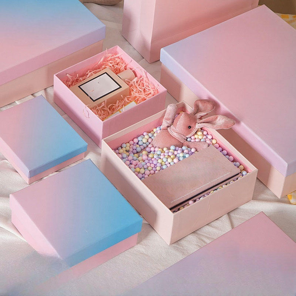
Argument title you can use: Experiential packaging matters. シーン PR seeding kits. Influencers don’t say “nice dieline.” They say “this feels expensive” or “meh.” That’s the whole game.
One practical trick: engineer the open/close like a mechanism, not like a decoration. Pull force on drawers, magnet strength, insert tolerance—those tiny details make the unboxing feel smooth, not cheap.

Minimal doesn’t mean plain. It means you remove the noise, then upgrade the materials and finishing.
Argument title you can use: Minimalist designs sell quiet luxury. シーン A mid-size brand wants to sit “near luxury” without going too flashy. A matte black box with a clean foil logo can do that, fast.
Monochrome palettes also make your cross-SKU assembly easier. When every variant is loud, you fight color drift across print runs. When it’s controlled, QA goes simpler.
Sustainability isn’t just a marketing line now. Buyers ask for it because retailers ask for it. And then your team ends up chasing compliance emails at 2am.
Argument title you can use: Sustainability is an expectation. シーン You’re selling in multiple markets, and you need paper-forward packaging that won’t trigger “too much plastic” feedback.
If you’re exploring paper-first 香水箱, start with the main category so you can compare structures side-by-side: 香水箱
The most practical move is reducing mixed materials. If you glue plastic + foam + film everywhere, recycling gets messy. Paper-based inserts and clean structures help a lot.
This combo works because it’s visual そして tactile. Matte gives softness. Gloss gives pop. You don’t need more art if your logo hits right.
Argument title you can use: Finish and texture do a lot of the luxury work.
Embossing is basically “proof by touch.” People run a finger over the logo without thinking.
Pro tip (factory-side): keep emboss depth realistic for mass production. If you push it too hard, you risk cracking on folds. It happens, sadly.
Windows reduce uncertainty. Shoppers see the bottle and feel safer buying it, especially in travel retail or gifting.
Argument title you can use: Windows reduce hesitation.
The trick is 違う making it look like a toy box. Pair the window with thick board and clean edges, so it still reads premium.
Foil is still one of the fastest “premium signals,” especially for logos and borders.
Argument title you can use: Metallic accents read premium when used selectively.
Keep it focused. One strong metallic detail usually beats five random shiny parts.
If you want that smooth open/close feel plus premium finishing, this structure is a common pick: マグネットクロージャーボックス
Illustration works when your scent has a story—place, ingredient vibe, mood, season. It also helps on crowded shelves where “another black box” disappears.
Argument title you can use: Storytelling graphics help a box stand out fast.
Abstract art is useful for modern scents because it avoids being too literal. It lets the customer imagine their own vibe. That’s kind of the point.

Personalization doesn’t have to mean printing every customer name. In B2B, it often means:
Argument title you can use: Personalization increases perceived value.
Limited drops live or die by “collectible” feeling. Packaging makes that happen, even when the bottle stays the same.
Drawer styles work really well here because they feel like a ritual, not just a box: 紙製引き出しボックス
Non-rect shapes grab attention, but they can complicate shipping and packing density. So the buyer question becomes: “Does this shape earn its keep?”
Use bold shapes for hero SKUs, seasonal sets, or collabs. For the core line, keep things stable so your warehouse team doesn’t hate you.
A cylindrical format can also stand out without killing packing logic: 紙管包装
Heritage patterns and motifs work when they feel intentional. You don’t want “random vintage.” You want “brand origin,” but cleaner.
Try this mix:
Here’s the part buyers care about most: how you turn trends into a packaging plan that doesn’t blow up at mass production.
If you’re doing wholesale, lead time pressure is real. You can reduce chaos by choosing structures with proven dielines and repeatable assembly steps, then using sampling to lock details early.
For bulk OEM/ODM, I’d look at these “safe but premium” setups:
For lightweight, retail-friendly formats, you can use: 折りたたみカートン
| Buyer scene (what’s really happening) | What’s the pain point | Box style that usually fixes it |
|---|---|---|
| New fragrance launch (hero SKU) | Need premium feel + protection | Magnetic rigid / lid-and-base |
| Gift set + PR kits | Unboxing has to feel “ceremonial” | Drawer slide-out / clamshell |
| Travel retail or “see the bottle” shelf | Customers want a peek | Window box / tube window |
| Subscription or e-comm shipping | Damage + scuffs | Rigid with snug insert / corrugated shipper |
| Minis and sampling programs | Lightweight, easy to pack | 折りたたみカートン |


