How Perfume Packaging Conducts Your Scent Symphony
Perfume packaging sets expectations before the first spray. This guide covers multisensory cues like color–odor correspondences, packaging weight, and sound cues, plus real box scenarios—magnetic closure, clamshell gift boxes, paper tube packaging, and folding carton.
You know that moment when you pick up a perfume and you already feel something—before you smell anything? That’s not magic. It’s perfume packaging doing its job.
In fragrance, the box isn’t “extra.” It’s the opening notes. It sets expectations, tells you what kind of scent story you’re about to hear, and nudges your brain toward “fresh,” “warm,” “clean,” or “rich.” If the packaging and the juice talk in the same voice, the whole experience lands better. If they clash, the scent can feel… off, even if the formula is good.
If you’re building or buying boîtes à parfum at scale (brand procurement, startup founder, packaging trader, private label team), this matters because you don’t just ship glass. You ship a feeling, a shelf moment, and a repeat-order trigger.
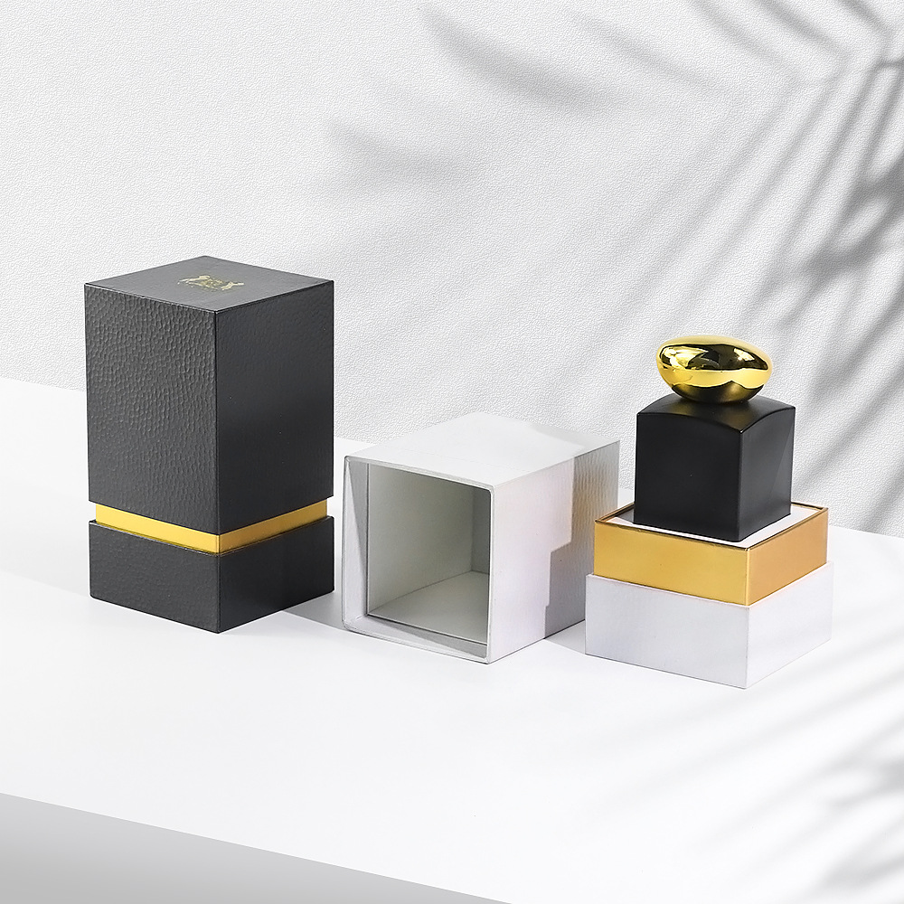
For reference, here’s the product family we’re talking about: boîtes à parfum.
Packaging sets expectations
People don’t “judge a book by its cover”… yeah right. They do. And perfume packaging is basically a cover plus a stage plus a handshake.
Practical takeaway: design your box to pre-load the vibe you want customers to smell. Don’t wait for the spray. Start earlier—color, weight, texture, opening action.
Unboxing interaction
Unboxing is a micro-ritual. It’s also a KPI in disguise. If the box opens clean, feels solid, and doesn’t fight the customer, they remember the brand as “thoughtful.” If it creaks, dents, or the lid floats loose, people feel the cheapness right away, even when the scent is premium.
Factory-side reality: this is where dielines, hinge scores, V-groove, and insert fit stop being “packaging talk” and start being brand protection. A good structure saves you from returns, crushed corners, and that painful “arrived broken” email.
Multisensory consistency
A perfume doesn’t live in one sense. The buyer sees it, touches it, hears it, then smells it. That order matters.
When visuals, touch, and sound all point to the same scent personality, customers relax. They accept the story. When one cue screams “clean minimalist” but the scent is syrupy night-club sweet, the brain does a little error beep.
Color–odor correspondences
There’s research showing color congruency can push higher buying intention when the packaging color matches the fragrance expectation (think citrus vs amber vibes). Another study used color intensity + package weight to shift how strong people penser a fragranced product is.
So yeah, “it’s just a box” is not true. Color can lean perception.
Une règle simple : pick a color system you can defend across SKUs. And keep it stable in mass run. Color drift kills trust fast.
Packaging weight
Weight is a shortcut signal for quality. A heavier feel often reads as “more premium.” But don’t blindly make it heavy. You’re balancing freight, protection, and hand-feel.
What pros do: add smart weight with rigid board structure and tight tolerances, then use inserts (EVA, paperboard, molded pulp) to stop bottle rattle. Less movement means fewer break claims and fewer headaches for your warehouse team.
Sound cues
Sound is the sneaky one. People remember it even when they don’t notice it.
The Audible Hint
That little magnetic “snick”, a soft slide, the quiet “click” of a lid seating right—this is a sonic signature. It builds anticipation and makes the whole thing feel deliberate.
If you want that “ceremonial” open without adding weird complexity, look at Boîtes à fermeture magnétique. They’re popular in high-end fragrance because the closure gives you a consistent close, a satisfying sound, and a clean edge line on shelf.
Structure drives real-world use cases
Here’s where it gets very non-poetic. Because you’re not designing for a mood board. You’re designing for cartons, pallets, planograms, and unboxing videos.
Boîtes cadeaux à clapet
Clamshell formats work when you need a “reveal” moment and strong wraparound protection—gift sets, discovery kits, holiday bundles, department store presentations.
They also help ops: stable geometry, repeatable pack-out, and easy insert alignment when your co-packer is moving fast. You can explore Boîtes cadeaux à clapet when you want ceremony et fewer transit issues.
Emballage en tube de papier
Paper tubes stand out because the shape breaks the rectangle wall on shelf. They also feel collectible, so people keep them. That’s free brand exposure sitting on a dresser.
If you’re aiming for “eco-friendly substitute” positioning with a premium unboxing vibe, check Emballage en tube de papier. Tubes also play nice with custom inserts, so your glass doesn’t spin or knock inside.
Carton pliant
For sampler programs, high-volume promo runs, or when you need efficient assembly, folding carton is the workhorse. It’s lighter, ships flatter, and runs well on automated lines if your dieline is clean.
If your pain point is speed + shelf readiness (not the heaviest luxury build), Carton pliant is a solid lane.
Tech packaging
Luxury buyers still love paper, foil, and texture. But tech is creeping in, mainly because brands hate counterfeits and love direct relationships.
NFC chips
Smart packaging (like NFC) can support authenticity verification and unlock content. The best part? It doesn’t have to look “techy.” It can live under the wrap, quiet and clean.
B2B angle: if you sell through distributors, NFC gives end customers a quick trust check, and it gives you data you can use for after-launch tweaks. Not perfect, but useful.
Sustainable sensory design
Sustainability is a vibe et a spec sheet. Brands want recyclable materials, FSC papers, and smarter structures. Customers want it to still feel expensive.
The tension is real: recycled and biodegradable materials can behave different in print and finishing. You might see more scuff, more fiber show, slightly different color absorption. That’s normal. You just need a supplier who calls it early and adjusts the process, not one who says “same same” then ships regret.
OEM/ODM workflow for bulk buyers
If you buy in volume, your biggest enemies are usually:
late sampling
weak insert fit (bottle rattle)
color drift between batches
“looks nice” but fails in transit
too much back-and-forth across vendors
An OEM/ODM workflow helps when one team owns structure, insert, finish, sampling, and mass production. It reduces handoffs, keeps tolerances tight, and makes QC more predictable. That’s why procurement teams care about things like AQL sampling, Pantone control, and traceability. It’s boring stuff, but it saves launches.
perfume box positions itself as an OEM/ODM custom luxury perfume boxes manufacturer in China with long production experience, FSC-certified options, and high daily output. That scale matters when you’re feeding big retail calendars. Also, yeah, it makes your life easier.
Align color, texture, closure feel, and silhouette
Academic research + packaging practice
Schifferstein et al. (2015); perfume-box category specs
Sound cues
The closing/opening sound becomes a memory hook
Tune magnets, lid friction, drawer slide resistance
Industry article + packaging practice
Like Beauty LLC (2025); Magnetic Closure Boxes / Clamshell structures
Tech packaging
Smart features can add trust and loyalty
Add NFC for authenticity + content
Industry article concept
Like Beauty LLC (2025)
Sustainable sensory design
“Eco” can’t feel cheap
Use FSC boards, recyclable papers, smart structures
Industry article + manufacturing practice
Like Beauty LLC (2025); sustainable box practice in rigid/tube formats
Color–odor correspondences
Color match can lift buying intention
Use a stable color system, avoid drift
Academic research
Schifferstein et al. (2015)
Packaging weight
Weight can shift perceived intensity/quality
Balance rigid build + inserts + shipping safety
Academic research
Gatti et al. (Food Quality and Preference, 2014)
Quick scenarios you can steal
New niche brand, first retail pitch: choose a rigid structure with clean edges and tight lid fit so buyers feel confidence fast. Add a tray so the bottle doesn’t dance inside.
Travel retail, tester-light counters: use a windowed clamshell or magnet style so staff can show the flacon without opening every box (less scuff, less mess).
Influencer PR kits: clamshell reveal plus insert cavities for minis works great. People film it. Your packaging becomes content.
High-volume seasonal promo: folding carton keeps it fast and consistent. Put the budget into print and finishing, not overbuilt structure.
One last thing: don’t over-design. A box should feel smooth and inevitable, not complicated. If the customer needs instructions, you already lost a bit of the magic, ok?
Depuis 1985, nous sommes un partenaire direct pour les boîtes à parfum de luxe personnalisées OEM/ODM en Chine. Une seule équipe s'occupe de la conception, de l'échantillonnage, de la production et de la logistique d'exportation. Un contrôle de qualité rigoureux permet d'obtenir des emballages conformes à la marque, des prix équitables et des délais de livraison fiables.
Des solutions OEM/ODM flexibles et professionnelles
Support OEM/ODM agile avec de faibles MOQ et des délais d'exécution rapides. Nos ingénieurs affinent les lignes de fuite, optimisent les structures et construisent des inserts personnalisés pour protéger chaque bouteille. Du concept aux échantillons pré-prod, nous accélérons les lancements avec des coûts et des risques prévisibles.
Gamme de produits complète et de haute qualité
Options de luxe complètes : boîtes magnétiques rigides, à tiroirs, à col épaulé avec plateaux personnalisés en EVA/mousse/pâte à papier. Les finitions haut de gamme - film, gaufrage/débossage, UV ponctuels - et les papiers FSC/recyclés améliorent l'impact, le déballage, la durabilité et la protection des bouteilles.