لا تقلق، اتصل برئيسنا على الفور
لا تتسرع في إغلاقه، الآن، يرجى التحدث إلى رئيسنا مباشرة. عادةً ما يتم الرد خلال ساعة واحدة.
الشركة المصنعة لصناديق العطور
الشركة المصنعة لصناديق العطور الفاخرة المخصصة في الصين
نستخدم SSL/3.0 لتشفير خصوصيتك

يشكل تصميم علب العطور الانتباه والعاطفة والقيمة المدركة. التسلسل الهرمي البصري يحافظ على سهولة قراءة الأسماء. يشير اللون والطباعة والهيكل إلى مستوى السعر. التصاميم الصلبة والتشطيبات الملموسة تجعل الإهداء وفتح العلبة يبدو مميزاً سواءً عبر الإنترنت أو في متناول اليد.
يمكن أن يكون لديك أفضل عصير في العالم، ولكن إذا كانت العلبة تبدو “رديئة”، سيتجاوزها الناس. هذه ليست دراما، إنها فقط طريقة عمل التسوق. عندما لا يستطيع المتسوق أن يشم رائحة العطر بعد (علبة مغلقة، قائمة على الإنترنت، شراء هدية)، فإن علبة عطر تصبح أداة اتخاذ القرار. فهي تشير إلى السعر والجودة والشخصية، وحتى “لمن هذا”، كل ذلك في لمح البصر.
إذا كنت تبيع أو تصدر علب العطور على نطاق واسع، أنت تعرف بالفعل المشكلة: التسويق يريد الإبهار، والمشتريات تريد الاتساق، والعميل يريد فقط شيئًا يبدو صحيحًا في اليد ويبدو صحيحًا على الشاشة. يفصل هذا المقال الدوافع الحقيقية - وكيفية تطبيقها باستخدام أنماط الصناديق العملية مثل الأغطية الصلبة القابلة للرفع، والأدراج، والأقفال المغناطيسية، والأنابيب.
ملاحظة سريعة: إذا كنت تريد تصفح الأنماط أولاً، ابدأ من هنا: علب العطور.

الناس يحكمون بسرعة. مثل, جزء من الثانية سريعًا. يسمي مقال جارسكينغ هذا “التقطيع الرقيق”-المتسوقون يستخدمون إشارات صغيرة (اللون، واللمسات النهائية، والطباعة) لبناء قصة: غالية/رخيصة، مرحة/جادة، متخصصة/سائدة.
كما أنها تعتمد على اختصار بسيط: الاستدلال على جودة السعر. إذا كانت العلبة تبدو ثقيلة ودقيقة وجيدة التشطيب، فإن المشترين يفترضون أن العطر أعلى جودة. وتدعم الأبحاث الفكرة العامة بأن التغليف يشكل بقوة سلوك الشراء في سياقات مستحضرات التجميل - وغالبًا ما يكون ذلك في لحظة عرض العطر على الرف.
وإليك حقيقة الشراء: أنت لا تبيع العطر فقط، بل تبيع الثقة. يقلل الصندوق من المخاطر المتصورة. فهو يخبر المشتري، “نعم، هذا شرعي.”
الرف (أو شبكة من بطاقات المنتجات على الإنترنت) عبارة عن فوضى عارمة. لذا يحتاج صندوقك إلى التسلسل الهرمي المرئي: يجب قراءة اسم العلامة التجارية واسم العطر ونوعه (EDP، مكثف، نوار) بالترتيب على الفور.
إذا كان التسلسل الهرمي ضعيفاً، يمكن أن يبدو الصندوق جميلاً ولكنه مربك - والمربك لا يحول. إن قطعة جارسكينغ صريحة: الوضوح + التباين + التصميم يقرر ما إذا كان سيتم التقاط الصندوق أم لا.
نصيحة عملية (ملائمة للمشتريات): قفل نظام قابل للتكرار:
هذا يجعل كتلة علامتك التجارية على الرف تبدو مقصودة وليست عشوائية.

اللون هو أسرع أداة “للتنبؤ بالرائحة”. وغالبًا ما تشير ألوان الباستيل إلى النعومة/الأزهار/النهار. ألوان الجواهر العميقة والأسود تشير إلى المساء والكثافة والفخامة. وتشير الألوان المحايدة إلى البساطة والنظافة والمكانة العصرية.
أيضًا: تتغير معاني الألوان حسب الثقافة (يمكن أن يُفهم اللون الأبيض على أنه النقاء في سوق ما والحداد في سوق آخر). يستدعي المقال هذا الأمر مباشرة.
سيناريو التطبيق: أنت تطلقين خطاً للجنسين ولا تريدين أن تكون “له / لها”. اختر الألوان المحايدة، والرسومات المقيدة، والطباعة النظيفة. هذا ليس مملاً. إنها إشارة.
الطباعة هي في الأساس صوت العلامة التجارية. يمكن أن تبدو الخطوط الرقيقة تراثية ورسمية. يمكن أن تبدو الكتابة بلا حروف عصرية وبسيطة ومحايدة بين الجنسين. يمكن أن يبدو النص المكتوب رومانسيًا - ولكن إذا كان صغيرًا جدًا، فإنه يقتل سهولة القراءة.
تعمل الصور بنفس الطريقة:
المفتاح هو المحاذاة. عندما يحكي النوع والصور والبنية نفس القصة، يشعر المشترون بالأمان عند اختيارها.
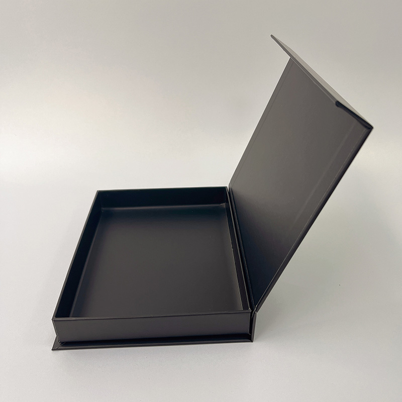
هذا هو المكان الذي تصبح فيه الفخامة مادية. بنية صلبة، وحواف حادة، وغطاء محكم، وزوايا نظيفة - يقرأ الناس ذلك على أنه فاخر قبل أن يقرأوا كلمة واحدة.
يشير المقال أيضًا إلى كيفية تحويل الهيكل إلى طقوس صغيرة للفتح: الحقائب المنزلقة، والأغطية التي تُرفع، وصناديق الأدراج, الإغلاق المغناطيسي. كما أن اللمسات النهائية الملموسة (ناعمة الملمس، النقش/الزخرفة، ورق القصدير) تجعل العلبة تبدو باهظة الثمن حتى قبل أن تظهر الزجاجة.
الآن الزاوية العلمية: تظهر الدراسات يمكن أن يؤدي التغليف الأثقل إلى زيادة الرغبة والاستعداد للدفع (يظهر في التجارب؛ إنه ليس مجرد “شعور”).
إذا كنت تريد طريقاً نظيفاً “ذا طابع مميز”، فهذا الطراز مصمم خصيصاً لذلك: صناديق الإغلاق المغناطيسي (لحظة الإغلاق المفاجئ تلك مرضية بشكل غريب، لن أكذب).

غالبًا ما لا يقوم مشتري الهدايا باختبار الرائحة بعمق. لذا فهم يستخدمون العلبة كوكيل: “هل يبدو هذا العطر مدروساً؟ هل هي جاهزة للإهداء؟ هل سيشعر المتلقي بأنه مدلل؟”
يسلط مقال جارسكينغ الضوء على
سيناريو التطبيق: مجموعات العلاقات العامة الخاصة بالعطلات، والإصدار المحدود، ومجموعات العلاقات العامة لكبار الشخصيات. غالبًا ما تهبط علبة الأدراج الصلبة ذات الرسالة الداخلية المطبوعة أفضل من علبة كرتونية أخرى عادية.
إذا كنت من محبي “الكشف” المنظّم، فهذا يناسب الطقوس: صناديق الأدراج الورقية.
على الإنترنت، يصبح صندوقك مستطيلاً صغيراً على شاشة الهاتف. يشرح المقال ذلك بوضوح: ما يبدو رائعاً في إضاءة المتجر يمكن أن يختفي في صور المنتج. لذلك أنت بحاجة إلى صور ظلية قوية، وكتابة مقروءة، وحجب ألوان جريئة، وتباين حقيقي.
كما أن وسائل التواصل الاجتماعي غيّرت القواعد: فيديوهات فتح العلبة تكافئ الكشف عن الطبقات والتصميمات الداخلية المطبوعة وآليات فتح “يا للروعة”.
سيناريو التطبيق: أنت علامة تجارية DTC تعرض إعلانات. يجب أن تعمل عبواتك كـ الصورة المصغرة أولاً، والتجربة اللمسية ثانياً. إذا فشلت في اختبار الصورة المصغرة، فلن يتم النقر عليها أبداً.
غالبًا ما يكون الهيكل النظيف الذي يصور بشكل جيد (ويتكدس بشكل جيد) عبارة عن صندوق صلب مكون من قطعتين. مثال على النمط: صناديق الغطاء والقاعدة.

لا يزال مشترو السلع الفاخرة يرغبون في الترف، لكنهم أيضًا يحكمون على الهدر. ويحذر المقال من أن العلب الكرتونية كبيرة الحجم والمكونات البلاستيكية الثقيلة يمكن أن تشير إلى “التبذير”، مما يضر بصورة العلامة التجارية.
تستجيب العلامات التجارية من خلال الألواح القابلة لإعادة التدوير، والهياكل أحادية المواد، وتقليل البلاستيك، مع الحفاظ على التميز من خلال الملمس + الطباعة + المعدن المقيد.
ونعم - إذا كان صندوقك يبدو مصممًا بشكل مبالغ فيه، فلن ينقذه الملصق البيئي الصغير. يجب أن يكون الهيكل تطابق المطالبة.
بالنسبة للشكل الذي يميل إلى الحفاظ على البيئة والذي لا يزال يعطي شعوراً بالتميز والاختلاف، فإن الأنابيب تعمل بشكل رائع لأحجام السفر والخطوط البسيطة: التعبئة والتغليف الأنبوبي الورقي.
| محفز قرار الشراء | يتفاعل مشترو عبوات التعبئة والتغليف مع | ماذا نبني (خطوة في العالم الحقيقي) | الدليل/المصدر |
|---|---|---|---|
| “هذا شعور رائع” | بنية صلبة، وحواف دقيقة، وهيكل متعدد الأجزاء | صندوق صلب، التفاف محكم، زوايا نظيفة؛ إضافة التحكم في تحمل الإدخال | إشارات الفخامة من الهيكل/المواد |
| “يمكنني قراءتها بسرعة” | تسلسل هرمي قوي، ونوع مقروء، وتباين | اجعل اسم العلامة التجارية + اسم الرائحة مقروءًا من مسافة بعيدة + في الصور المصغرة | التسلسل الهرمي البصري ووضوح القراءة |
| “هذا يطابق شعوري” | رموز الألوان + رموز النمط (باستيل أو نوار أو محايد) | بناء نظام ألوان برائحة العائلة + ثقافة السوق | علم نفس اللون والثقافة |
| “أنا أثق في هذه العلامة التجارية” | طباعة وصور متناسقة | حافظ على اتساق الطباعة/اللغة البصرية عبر السطر الواحد | اتساق أسلوب الإشارة إلى النمط |
| “الأمر يستحق دفع المزيد من المال” | الوزن/إشارات اللمس | أضف ثقلًا ملحوظًا من خلال لوح صلب + حشوات + تشطيبات | وزن العبوة يمكن أن يرفع الرغبة في الدفع |
| “لحظة الجرف مهمة” | التغليف كمحرك للمبيعات في مستحضرات التجميل | تعامل مع العبوة الخارجية كأداة للعلامة التجارية، وليس كفكرة ثانوية | تؤثر التعبئة والتغليف على الشراء في سياقات مستحضرات التجميل |
| “اجعل هذا الأمر سهل التنفيذ على نطاق واسع” | الهندسة + التحكم في الألوان + الاختبار | خطوط الطبع، ومطابقة ألوان البانتون، واختبارات السقوط/الاهتزاز، واتساق ما قبل الطباعة | خدمات تصنيع المعدات الأصلية/التصنيع حسب الطلب: الهندسة، والاختبار، والتشطيب، ودعم شركة تصنيع المعدات الأصلية/التصنيع حسب الطلب |
عندما تنتقل من التصميم إلى الإنتاج الضخم، تنتهي مرحلة “النموذج الجميل” بسرعة. ما تحتاج إليه حقًا هو قابلية التكرار: خطوط لا تنحرف، وألوان تظل متناسقة، وإدخالات لا تهتز، ومراقبة جودة تكتشف المشاكل قبل أن يكتشفها العميل.
على موقع perfume-box.com، يصف الموقع إعداداً متكاملاً لتصنيع المعدات الأصلية/التصنيع حسب الطلب مع اختيار الهيكل/المواد، والهندسة وإدارة الألوان (بما في ذلك مطابقة بانتون)، والاختبار (السقوط/الاهتزاز)، والتشطيبات المتميزة (رقائق معدنية، والنقش/النقش/النزع، والأشعة فوق البنفسجية الموضعية، والقوام)، وملصقات الامتثال متعددة اللغات، ودعم سلسلة الحفظ FSC. كما تنص أيضًا على الخبرة والقدرة على الإنتاج: “39 عامًا من الخبرة و1 مليون من الإنتاج اليومي” بالإضافة إلى وضع معتمد من FSC.
هذا مهم لـ
إذا كنت تخطط لتحديث الخط، ابدأ بسؤال واحد: ما الذي يجب أن يشعر الناس به الصندوق في أول ثانيتين؟ قم ببناء كل شيء من هناك.


