-
Meicun Road, Meilin, Futian District, Shenzhen, Guangdong, China
16 Amazing Designs for Inspiration Of Perfume Packaging
16 perfume packaging designs you can actually use: minimalism, floral, Art Deco, vintage, geometric, wellness, celestial, urban, and interactive. Includes box structure picks (magnetic closure, tube, drawer, folding carton) and OEM/ODM notes.
You can spend months tuning a fragrance. Then the bottle hits the shelf (or an online thumbnail), and the box gets a few seconds to do its job. It has to protect glass, look premium, and make people feel something fast. That’s basically the whole perfume packaging game.
Below is the classic “16 designs” inspiration list (minimalism, floral, Art Deco, interactive, etc.). I’ll keep it practical, so you can turn ideas into a dieline + finish plan, not just mood boards.
Key arguments you can use in a brief (and show to your boss/buyer team):
| Argument (use as a talking point) | What it means in real projects | Proof anchor |
|---|---|---|
| Packaging speaks first | The box sets expectations before anyone smells anything | “Packaging…plays a crucial role in influencing purchasing decisions” |
| Minimalism sells premium | Less text, more control: paper, spacing, tiny details | “Elegant Minimalism…clean lines…understated typography” |
| Nature cues explain the scent | Botanical visuals make notes feel “obvious” | “Floral…botanical illustrations” / “Nature’s Bounty…botanical” |
| Vintage = story + trust | Retro type and palettes signal heritage | “Vintage Charm…nostalgia…bygone eras” |
| Geometry = modern + bold | Shapes + patterns create shelf pop, fast | “Geometric Geometry…bold…visually striking” |
| Touch upgrades perceived value | Finishes and structure change “worth it?” instantly | “Luxury perfume boxes…finishes…foil…spot UV” |
| Structure creates the unboxing moment | Box style is part of the product, not a container | “Mini billboards…Structure…feels premium” |
| Interactive details get shared | Hidden parts, inserts, pop-ups boost memory + UGC | “Interactive Innovation…hidden compartments…interactive inserts” ( |
| Sustainability should be real, not cosplay | Use FSC/recycled papers + less plastic, and say it clearly | “FSC materials” mentioned across production + ranges |
| OEM/ODM needs repeatability | Pantone control, QA, scalable assembly across SKUs | “OEM/ODM…FSC…AQL/traceability…dielines & QA reports” |
Now let’s walk through the 16 designs (same keywords, no made-up headings), with “where it works” scenarios.
Elegant Minimalism:
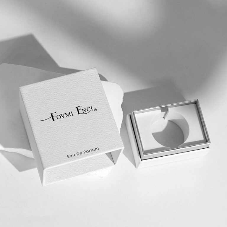
If your brand wants “quiet luxury,” this is the safe bet. One clean logo, calm color, and a paper that feels expensive. The trick is: don’t leave it empty. Give the buyer one small “premium cue” (deboss, foil line, soft-touch).
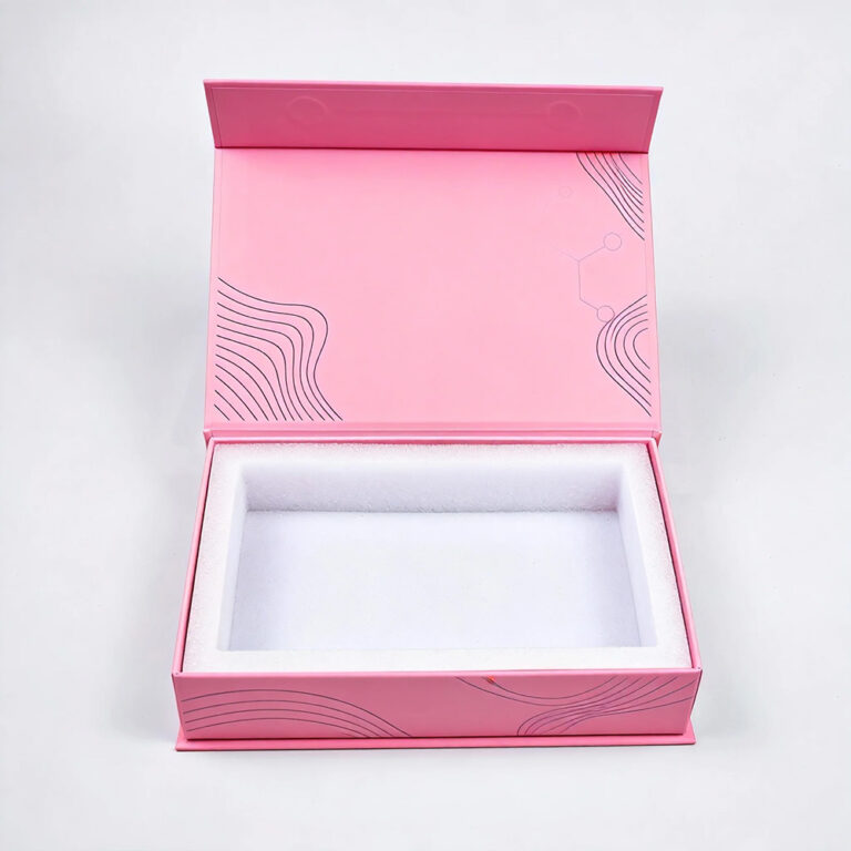
A very common pairing here is rigid magnetic, because that soft click feels like money. If you want that structure, look at perfume boxes.
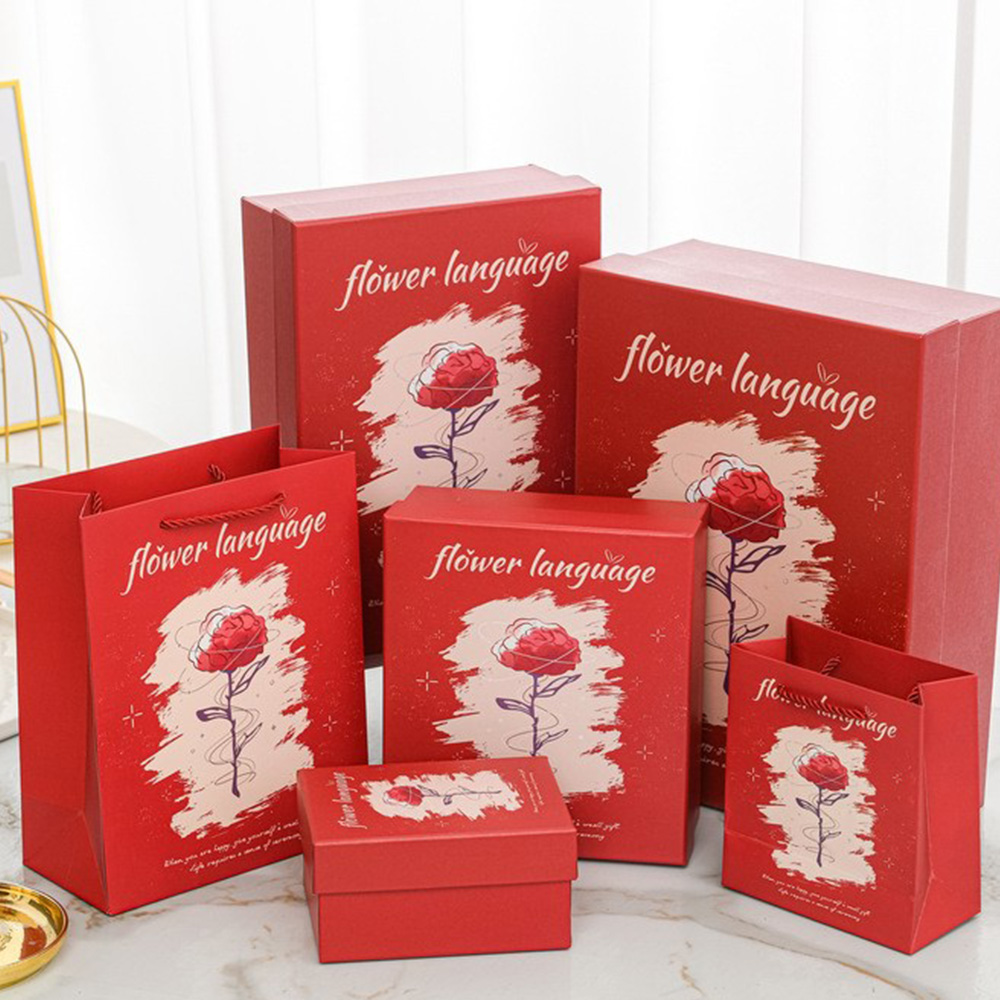
Floral Fantasy:
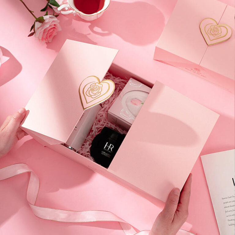
This is for romantic scents, bridal drops, spring launches, or anything “light and pretty.” Go beyond printing flowers. Add a tactile layer: embossed petals, textured stock, maybe a subtle pattern inside the lid.
Use case: gifting sets where people buy with their eyes first.
Art Deco Glamour:
Art Deco is built for gold foil, strong symmetry, and bold geometry. It screams “premium” without a long story. Great for department store counters and duty-free, where everything is fighting for attention.
Vintage Charm:
Vintage packaging works when your scent story leans “heritage,” “apothecary,” or “classic Paris” vibes. Keep it controlled though. Too many retro elements can look messy in production (and then QC gets spicy).
Buyer pain point it solves: “Our bottle looks like everyone else’s private label.” Vintage graphic codes help you stand out even with a shared bottle mold.
Whimsical Wonderland:
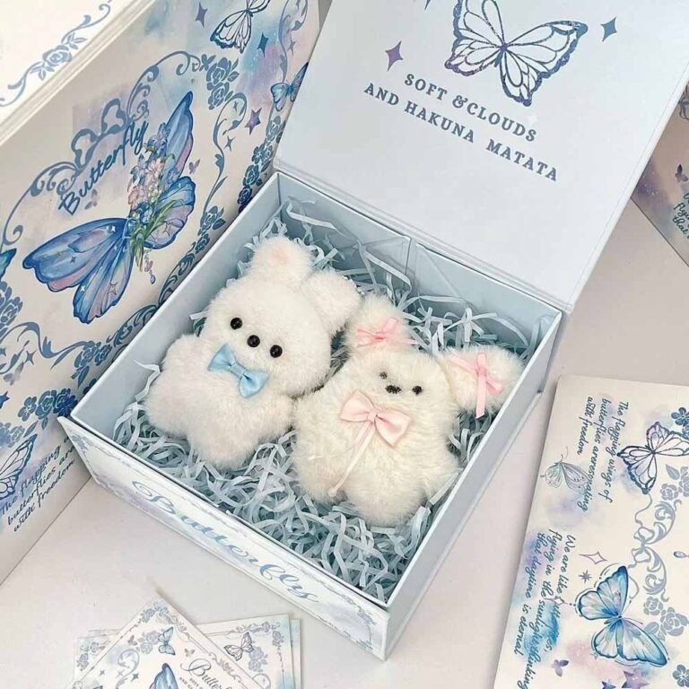
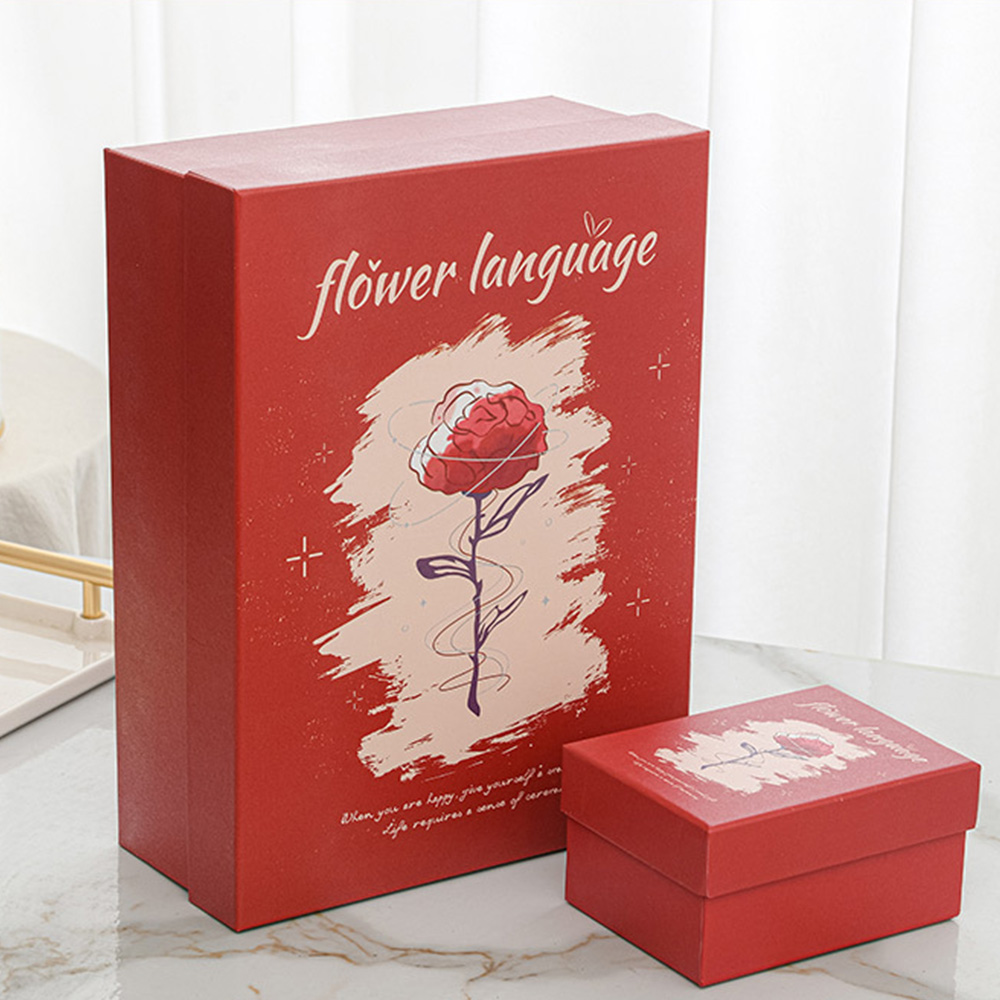
This is for playful launches, collabs, seasonal limited drops, or influencer PR. You’re selling emotion and shareability. Add a “surprise” layer inside (a character, a hidden quote, a mini scene).
Cultural Inspiration:
Done right, it feels rich and respectful. Done wrong, it feels like a cheap costume. Keep it authentic: use real pattern logic, correct symbols, and a clean explanation on the inner print.
Procurement tip: lock the art early, because late changes can break consistency across batches in OEM runs.
Modern Minimalism:
This isn’t the same as “Elegant Minimalism.” Modern minimal usually uses bolder typography, sharper contrast, and a more editorial layout. It fits unisex lines and design-forward brands.
Nature’s Bounty:
Nature-led packaging is perfect for “clean,” “green,” and ingredient-first positioning. If your brand talks about essential oils or botanicals, don’t bury that. Make it visible and easy.
For structure, tubes are underrated here. They give you 360° print area and feel “giftable” even without extra wrap. See Paper Tube Packaging.
Avant-Garde Innovation:
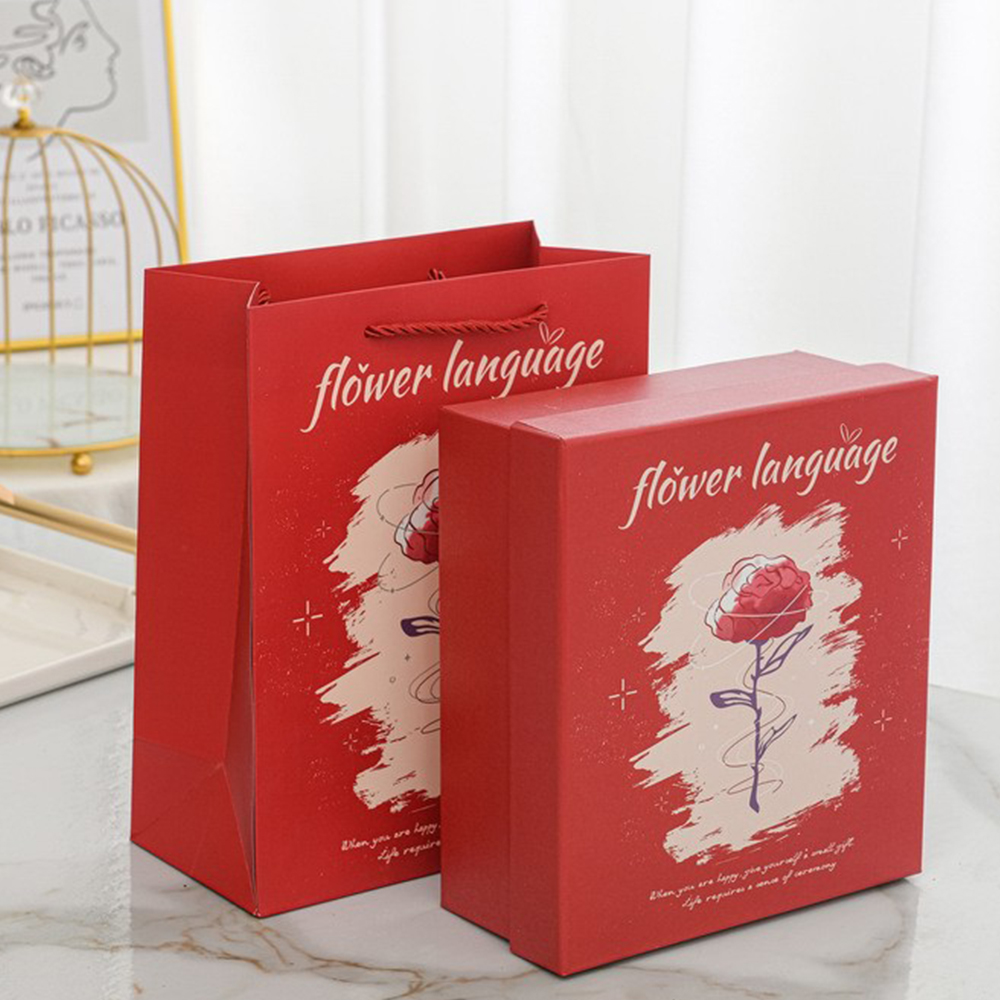
This is where you break the rules: weird materials, unexpected openings, asymmetry. It works best for niche houses, art fragrances, and limited editions (because scaling crazy builds is… yeah, not fun).
Real-life scenario: a launch drop where the box becomes part of the collectible.
Geometric Geometry:
Geometric packaging is a fast way to create shelf impact with simple tools: shape repetition, optical patterns, strong color blocks. It photographs well, which matters for DTC.
For travel sizes and multi-SKU campaigns, cartons can be a smart move because they’re lightweight and clean on edges. Here’s the category: Folding Carton.
Wholesome Wellness:
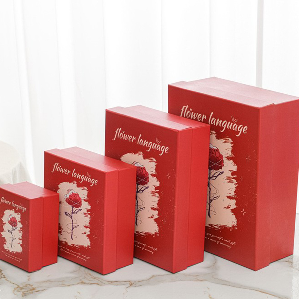
Wellness design uses soft palettes, calm visuals, and “breathing room.” Think yoga/meditation cues, but keep it modern so it doesn’t look like a candle brand from 2012.
Celestial Splendor:
Stars, moons, iridescent finishes—this one is made for night scents, date-night perfumes, or anything “mysterious.” Just watch your finish stack. Too many effects layered can raise defect risk.
Urban Edge:
Urban style is typography-led: graffiti vibes, industrial textures, punchy color. Great for younger audiences and streetwear collabs.
Simple win: put the loudness outside, keep the inside clean. It feels intentional, not chaotic.
Timeless Classics:
This is your “safe luxury” lane. Balanced layout, classic details, nothing too trendy. It’s perfect when procurement wants low risk across many markets.
And if you’re doing OEM/ODM at scale, repeatability matters: consistent alignment, stable assembly, QA reporting, the whole boring-but-important part.
Ethereal Elegance:
Ethereal is soft, airy, dreamy—often fantasy or mythology cues. Use translucent effects (visual, not fragile materials), gentle gradients, and light textures.
Scenario: bridal gifting, “first perfume” products, soft musks.
Interactive Innovation:
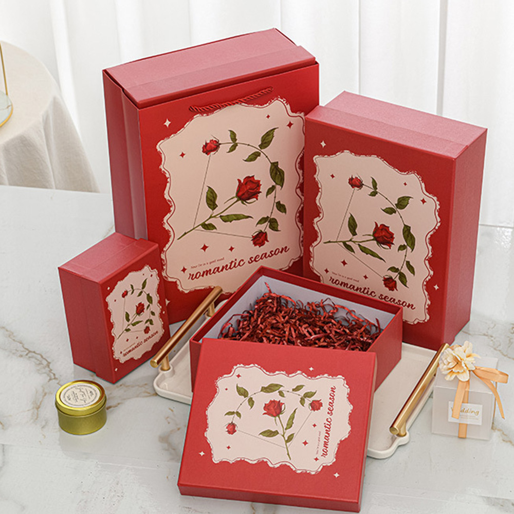
Interactive packaging is where you earn the unboxing moment: hidden compartments, pop-ups, inserts that feel like a reveal. This is how you get UGC without begging for it.
A super practical structure here is the drawer format, because it builds that “reveal” step naturally. If you need a supplier-ready category page: Paper Drawer Boxes.
Also, magnetic closure boxes are basically the default “luxury unboxing” choice in beauty, because the close feels secure and premium. Here’s the category link once (no repeats): Magnetic Closure Boxes.
Quick OEM/ODM note (for buyers): Perfume-box positions itself as an OEM/ODM custom luxury perfume boxes manufacturer in China, mentioning 39 years experience, 1M daily output, and FSC certified production. That matters if you’re a brand team juggling many SKUs, or a distributor who can’t afford inconsistent batches.


